Simple and Lively Onboarding
Sleek helps foreigners and locals register their companies in Singapore. It also provides services like company accounting, virtual mail rooms and corporate secretary services. Founded in 2017, Sleek hired me as its first UX Designer at the start of 2018.
Process
- Understanding the product and its various issues.
- Prototyping, testing and iterating through wireframes, user flows, and feedback.
- Working with the marketing team to create an initial style guide and component library.
Gathering Information
- Chats with colleagues: The Sales and Marketing colleagues interacted most with the clients. Gathering information from them helped me understand the business and the users.
- Google Analytics: The marketing team has been tracking the sites using Google Analytics. We could see the pages where clients typically leave their sessions from.
- Observation: I also sat down with a colleague in the Corporate Secretary team, observed her preparing the documents for company incorporation, and noted some problems she encountered.
- Heuristic evaluation: A heuristic evaluation was also conducted based on Nielsen’s usability heuristics.
Challenges
The platform had various issues with information and visual design.
- Firstly, there is major information overload in several parts of the platform including the onboarding flow. Despite already having multiple steps in some of the flows, each step is still crowded with jargon and options. For example, the first step for the incorporation flow mentions “Mail Cloud”, and the user would have to read a whole paragraph to understand what it is. (It is a service in which Sleek scans and uploads physical mail for the client.) The first step also immediately required users to decide what other services they wanted, and this would affect the options in the other subsequent steps.
- There is also an unmet business requirement to surface other Sleek services and partnerships in the web application. The site focused on corporate secretary services and did not consider the other existing accounting services and plan bundles with partners (for example, bundles with services from Xero, an accounting software subscription).
- A co-founder also felt that the overall look and feel of the whole web application was too “template-like, corporate and monochromatic.” The new direction was to have something more visually upbeat, that would fit the brand image of a company that is breaking free from other traditional, dull and tedious incorporation processes.

Understanding User Journeys
High-level user flows
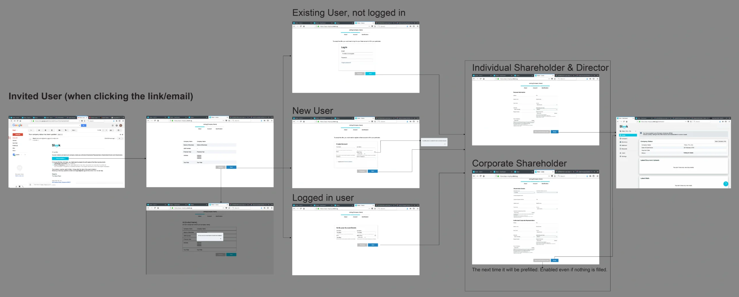
Working with the stakeholders, we started with mapping the different user journeys. The first thing we needed to acknowledge was that not all users have to go through this specific onboarding process. For example, there may also be users who need to upload the necessary documents or have partial access and permissions to the Sleek mail room. Instead of going through this onboarding process, they will be invited to create accounts by the company owners and they might need to go through other flows like identity verification.
From the higher-level user flows, we can see the different user journeys for the different situations. This helped in defining a roadmap of the parts that needed to be designed and developed.

Prototyping
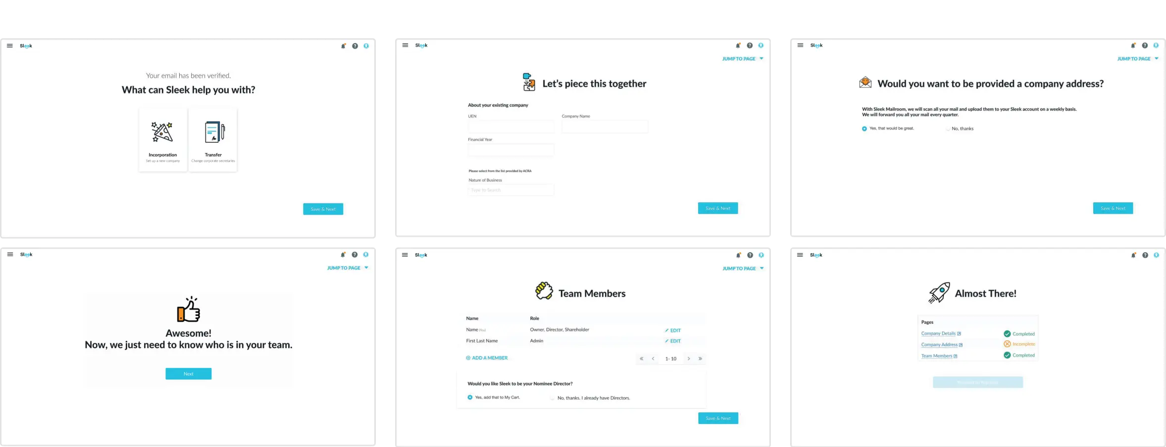
Concentrating on one step at a time
To reduce information overload, the general strategies were to break things down into smaller steps and show only what is necessary for that step. For example, in the initial site, before the onboarding flow, the user would still see many disabled menu items and empty sections. This makes the call-to-action less obvious.

Testing Process
- Drafting the test plan by defining the user scenarios and tasks, preparing post-test questions, and writing the script for consistency.
- Recruiting colleagues and friends as participants.
- Conducting the usability tests using clickable prototypes.
- Gathering the feedback collected and prepare for iterations.
Iterating
Surfacing other Sleek services
In one of the earlier wireframes, accounting services was one of the grouped services shown in one of the first steps. It was later framed as an add-on to be considered later. The rationale for this is to further spread out the options over the pages, so that the user could first focus on either incorporation or transferring corporate secretary services.

Email Verification
One of the discussions was whether email account verification needs to be before the onboarding flow. Allowing new users to jump straight into the flow without email verification would allow the users to get a better overview and sense of the various services they can get from Sleek. This is especially so if they are comparing prices and details with offerings from other competitors.

Allowing users to save and come back later
Some users might need time to gather relevant documents and information for the forms, so the processes need to allow them to save and come back later. This also means that they may also need the ability to jump to different pages.

Adding to Roadmaps
Allowing the user to switch accounts
One of the considerations during the design process is that the same user account email could belong to multiple companies in Sleek’s system. In other words, we also needed a way for the user to switch company/accounts.
Visual feedback on the total price
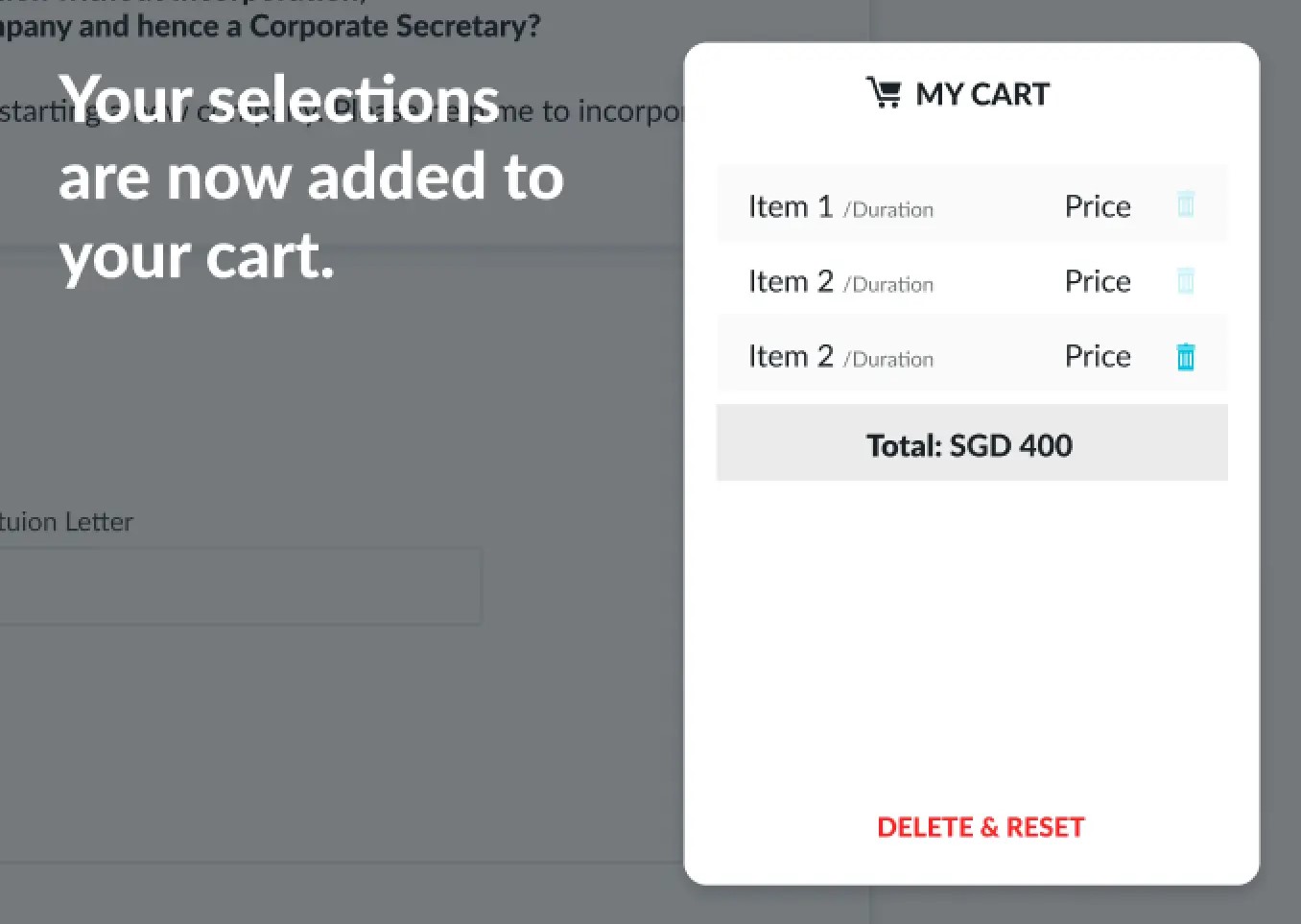
In the iteration process, a cart was, at some point, added to every screen. This increases visibility to the total amount that the user would be paying. This will be especially useful if they are comparing prices and details with offerings from other competitors. However, it was removed to be added for a future update.

Art Direction
Working with the marketing team, we came up with a initial style guide for the illustrations, colors and text. The general direction was to portray vibrancy and fun. This was reflected in bolder colors that complement the already-existing main brand color. In illustrations, the lines were also less straight and rigid, and the overall feel oozed a small ounce of whimsical magic. This fits the brand image of a company that is breaking free from other traditional, dull and tedious incorporation processes.

Design System
While iterating on the onboarding flow, we also defined some components and guidelines for better consistency between the information site and the web application.
High-Fidelity Prototype

Impact
Over the years, due to its amazing teams and ability to answer user problems, Sleek has expanded to Hong Kong, Australia, and the UK. After leaving the company for further studies, the visual design system has since gone through other iterations, including a shift in brand colors. Overall, I would still like to think that I have at least been a piece of its puzzle in its growth. Particularly in information design, it was a major step forward from the initially wordy and overloaded MVP.
Back to Top
